
What Can Visualisation Do?
I recently attended the What Can Data Visualisation Do? event which was part of the ESRC Festival of Social Science. There were some really interesting talks, and two in particular that stuck out.
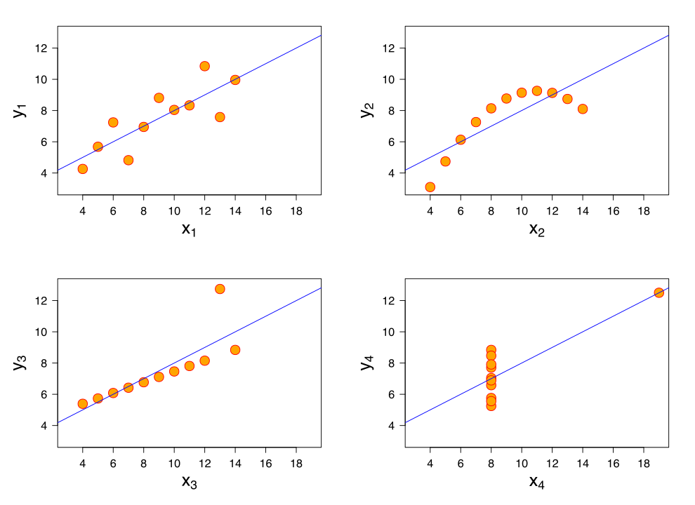 It began with Alan Smith (@theboysmithy) who made an excellent case for the simple chart. He used the example of Anscombe’s Quartet to show that four data sets with the same mean and standard deviation can actually be very different. A chart shows this really well. I picked up his three ‘golder rules’ as:
-
Charts need to be self contained - you should be able to understand them fully without having to read surrounding text. This also makes them suitable for posting to social media etc.;
-
Annotations can be used liberally (where appropriate) to make the meaning of the chart clearer;
-
Use colour to pick out important features.
Thomas Clever (from CLEVER°FRANKE) then talked about the shift from visualisation for analysis (basically display loads of stuff and let the reader find the insight) to visualisation for insight (simpler, more refined, with important things highlighted).
Finally, one of the most useful resources that we were introduced to was Andy Kirk’s _visualising data _website (see the screenshot below). It has a huge number of resources, including advice on how to display data and which tools are good to use. I’m keen to learn more about NodeBox in particular.

A screenshot of Andy Kirk’s visualising data website.